Website experience optimization in support of the Exxon Mobil Rewards+ loyalty program app release that required members to migrate to a new platform.
My Role
Lead UX Designer
Team
UX Director, Account Executives, Strategists, Project Managers and Creatives
Scope
4 months for sitemap, user flow, wireframes, visual designs and annotations

Context
Global fuel brands Exxon Mobil created a marketing campaign for the Exxon Mobil Rewards+ app platform updates to inform members of upcoming changes and action required but weren’t sure about implications.
Challenge
The platform release required existing users to manually migrate by updating the app through their devices marketplace which can be a frustrating experience especially for those who don’t update before visiting a fuel station.
Problem
The transition could frustrate users and lead to app abandonment all together.
Solution
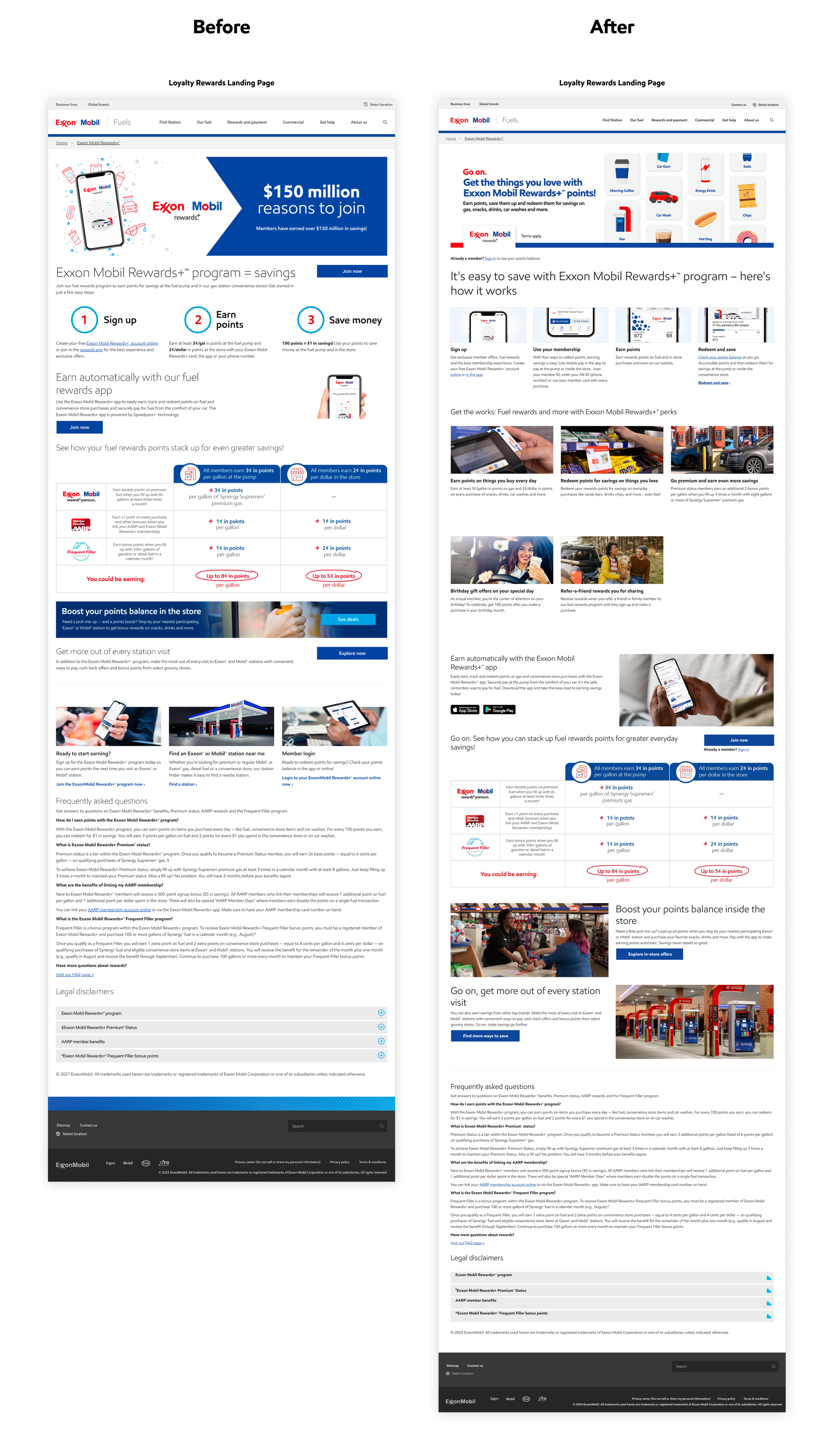
An optimized loyalty rewards experience designed to seamlessly transition existing members and acquire new members through new dynamic, journey-specific content across owned channels & touchpoints.
Location
Live Exxon Mobil Rewards+ landing page: https://www.exxon.com/en/rewards-program
Live Exxon Mobil Rewards+ microsite: https://rewards.exxon.com/welcome/home
Results
Transitioned more than 90% of active app users in 90 days.
Process
This project kicked off with an internal team meeting where we reviewed the project brief, scope of work and aligned on a path forward. It was then followed by a discovery and define phase that involved auditing our clients marketing campaign plan while also conducting user and app research in tandem. All this information was used to come up with a comprehensive strategic approach inclusive of CX/UX recommendations.
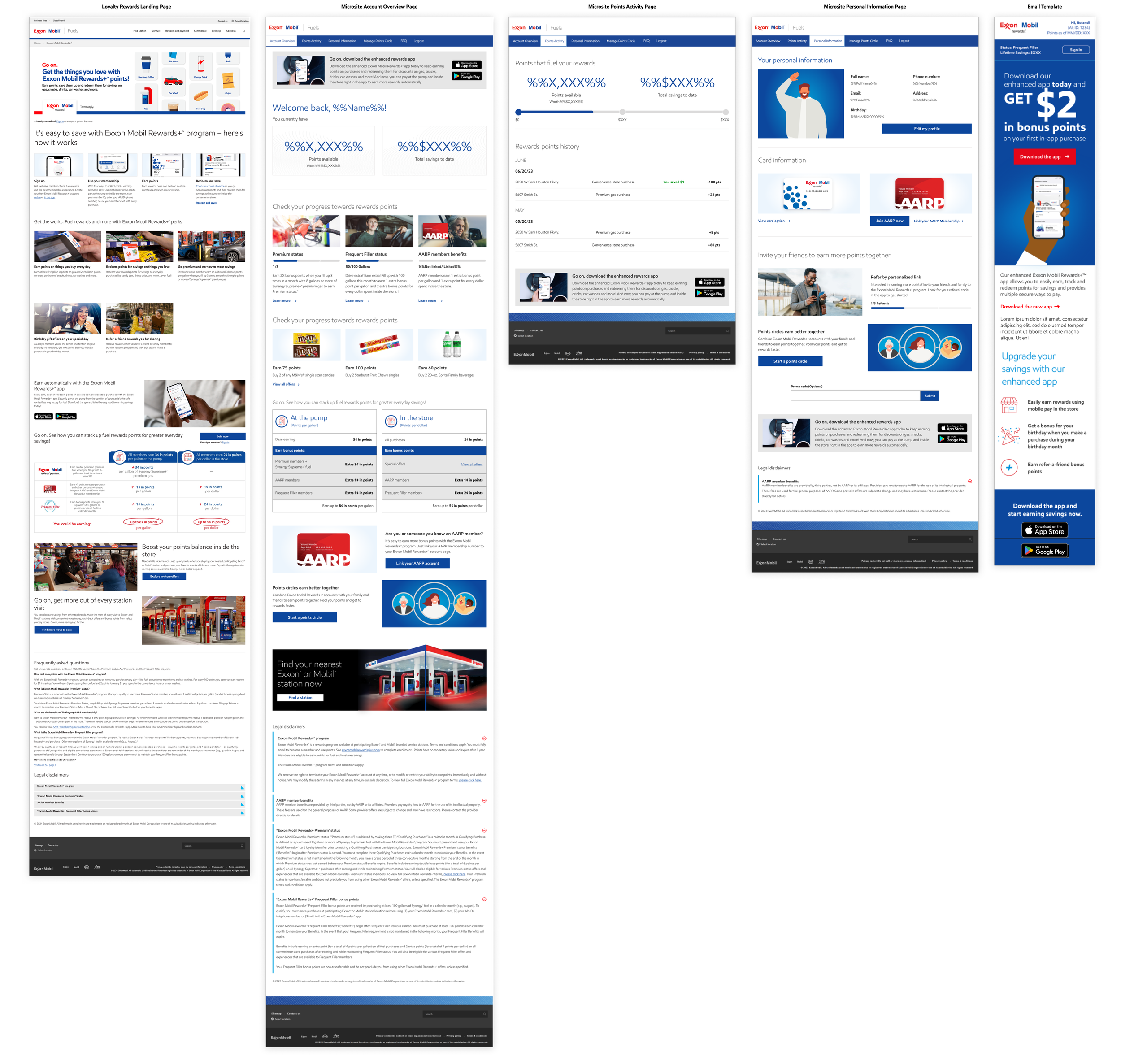
Once the strategic approach was approved I moved into the design phase and used insights gathered from research to create a user flow that showed how frustrating the app transition experience could be for users who don’t update before visiting a physical Exxon Mobil station. After this I created wireframes for digital touchpoints this would impact to visualize future state of the optimized experience. I then presented to stakeholders and gathered feedback to refine the recommended experience. Once updated, I briefed my Creative team and worked with them to turn mid-fidelity wireframes into high-fidelity designs.
After those were approved I moved into the deliver phase and put together annotations to provide developers with detailed instructions of component placement and functionality. We eventually met to discuss feasibility as landing page, microsite and email touhcpoints were built with different components and styling. From there I updated annotations to reflect the developers feedback and packaged up all documentation for implementation hand-off. Developers then created a staging site where we conducted quality assurance testing before launching live October 2023.
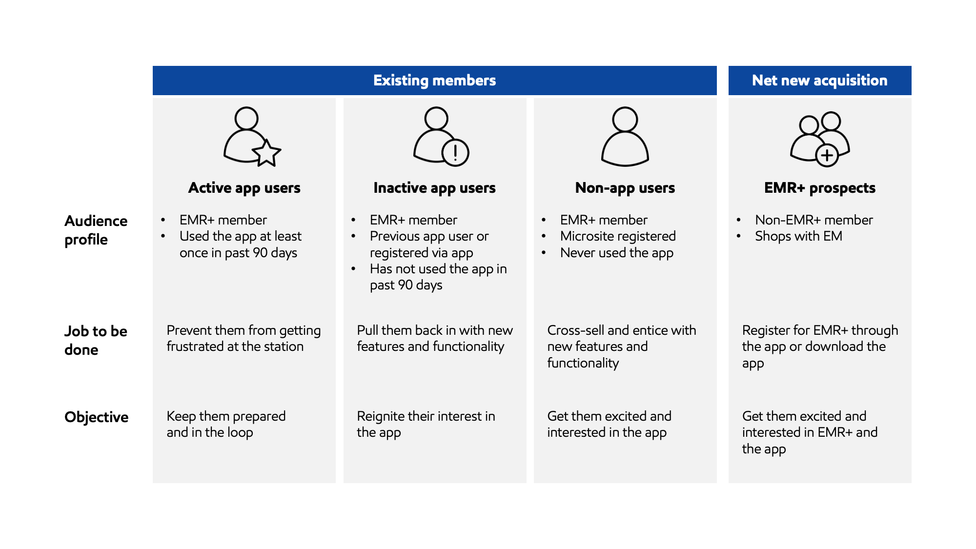
Target Audience

Userflow


Wireframes

Visual Design


Annotations
